
The Social Proof Secret
Trust is the most expensive currency on the internet. For a first-time visitor, every request for a transaction, whether it’s a donation, a subscription, or a purchase, is met with an internal "risk assessment."
If the perceived risk outweighs the perceived value, the user bounces. Kiva.org, a leader in the micro-lending space, faced this exact hurdle: how do you convince a total stranger to part with their money for a cause they just discovered?
The Objective: Increase the rate of donations from first-time visitors to the Kiva platform.
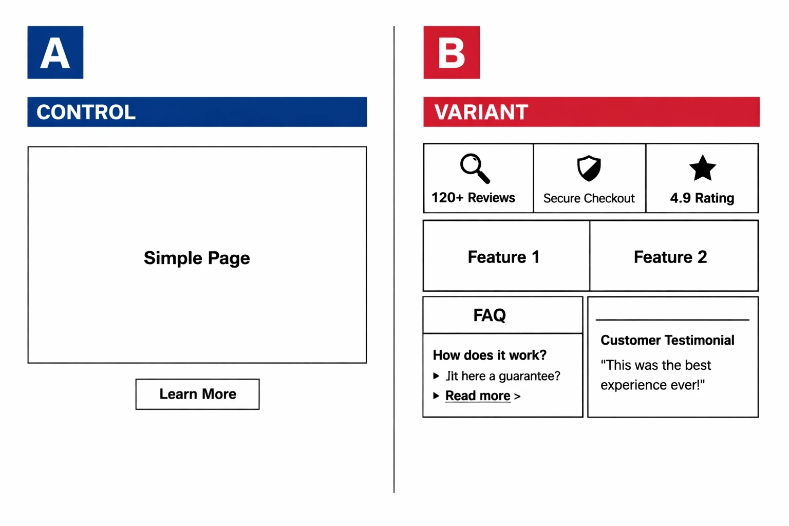
The Intervention: Implementation of a modular information box at the bottom of the landing page featuring social proof, statistical impact, and a concise FAQ.
The Methodology: A rigorous A/B test comparing the original landing page against a variant with the added trust module.
The Outcome: An 11.5% statistical lift in donations.
The Core Insight: Transparency and proactive objection handling are more effective at driving conversions than aesthetic polish alone.
Case Study Summary
Why do first-time visitors hesitate to convert?
First-time visitors suffer from "Anonymity Anxiety." Without prior brand equity, they look for external validation (social proof) and logical reassurances (FAQs) to justify the risk of a transaction.
When a user lands on a site for the first time, they aren't just looking at your product; they are looking for reasons to leave. This is especially true for non-profits or SaaS companies where the "product" isn't a physical object they can hold. At Kiva, the challenge was twofold: the user had to believe in the mission, and more importantly, they had to trust that their money would actually reach the intended recipient.
High bounce rates on landing pages often stem from unanswered questions that linger in the user's mind. Is this legitimate? Where does the money go? Has anyone else actually done this? If these questions aren't addressed within the flow of the page, the friction becomes insurmountable. In conversion rate optimization (CRO), we refer to this as the "Friction-Trust Gap."
Can strategic information boxes bridge the trust gap?
The hypothesis was that by consolidating social proof, impact data, and FAQs into a single, high-visibility module, Kiva could lower the cognitive load required for a visitor to feel "safe" enough to donate.
Kiva hypothesized that first-time visitors weren't lacking motivation; they were lacking certainty. The team decided to test a specific design element: a modular "information box" placed strategically at the bottom of the landing page.
The strategy wasn't just about adding more text. It was about addressing the three pillars of digital credibility:
Social Proof: Validating that a community already exists and trusts the brand.
Hard Data: Providing objective proof of efficacy (e.g., "$2.4 billion+ in capital mobilized").
Objection Handling: Using an FAQ to answer the "Yeah, but..." questions before the user has to go looking for an "About" page.
By placing this information in a modular, easy-to-digest format (similar to the modern "Bento Grid" aesthetic), they aimed to provide a safety net for users who had scrolled through the emotional pitch but were still hovering on the edge of a decision.
What did the A/B test actually look like?
The test compared a streamlined, "clean" landing page against a version that included a dense but organized information cluster featuring third-party endorsements and "how it works" statistics.
In the control version, the landing page followed a standard donor journey: hero image, mission statement, and call to action. It was visually appealing but left the "burden of proof" to the user, they had to navigate away or scroll extensively to find credibility markers.
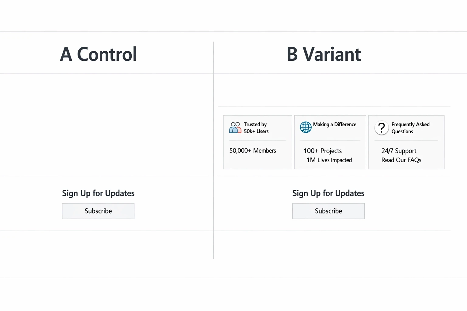
The variant introduced a modular section at the footer of the page. This wasn't a pop-up or a sidebar; it was a foundational part of the page hierarchy.
The Variant contained:
Social Proof: Mentions of reputable media outlets and the number of active lenders.
Impact Statistics: Real-time data regarding repayment rates and total loans funded.
Concise FAQ: Three to four high-impact questions regarding the "safety" of the micro-loan process.
This design prioritized clarity over cleverness. By utilizing a grid-based layout, Kiva ensured that the user didn't feel overwhelmed by the additional information. Instead, it felt like a professional "fact sheet" that validated the emotional appeal of the top-of-page content.
How did an 11.5% lift change the strategy?
The variant resulted in an 11.5% increase in donations from first-time visitors. This proved that for new users, "more information" (when structured correctly) outperforms "minimalist design."
The results were a clear win for the "Information-First" approach. An 11.5% increase in donations is a massive move for a platform as large as Kiva. But the real value lies in why it worked.
The data suggested that the information box acted as a "conversion closer." While the hero section captured interest, the social proof and FAQ box provided the logical justification needed to complete the action. This is a classic example of how conversion rate optimization relies on understanding the psychological state of the user at different scroll depths.
For many brands, there is a fear that adding "too much content" will clutter the design or distract the user. Kiva’s results challenge this. When content is organized, using clean lines, high contrast, and modular boxes, it doesn't feel like clutter; it feels like authority.
What are the key takeaways for SaaS and DTC brands?
You don't need a total redesign to see double-digit growth. Often, the solution lies in identifying the "unspoken objections" of your users and answering them with social proof and data at the point of decision.
The Kiva case study provides a blueprint that is highly applicable to both SaaS and DTC sectors. If you are seeing high traffic but low conversion, your site might be failing the "Instant Trust Test."
1. Address the "Anonymity Anxiety"
If a visitor doesn't know your brand, they are looking for a reason to distrust you. Use social proof (logos, testimonials, or user counts) not as an afterthought on a dedicated page, but as a recurring theme throughout the journey.
2. Use Data as a Weapon
Vague claims like "We help you grow" are ignored. Specific claims like "Over 5 million borrowers supported" (Kiva's approach) are sticky. Quantify your value proposition whenever possible.
3. The "Bento Grid" for Information Density
Organize your trust signals into modular boxes. This allows you to present a large amount of information, FAQs, stats, and reviews, without making the page feel heavy. A grid-based layout keeps the user’s eye moving and makes the content feel "snackable."
4. Answer Questions Before They Are Asked
Identify the top three reasons someone might say "no" to your product. Is it the price? The shipping time? The security of the data? Put those answers right next to your CTA.

How to get started with social proof and transparency
If you want to replicate Kiva's success, you don't need to overthink the design. Start with the data you already have and structure it for the "skeptical stranger."
Audit your "unspoken objections": Look at your customer support logs or exit surveys. What are the common hesitations?
Create a "Trust Module": Design a clean, high-contrast box for your landing page. Include one "social" metric (e.g., "Joined by 10,000+ users"), one "impact" metric (e.g., "Saved users 500 hours"), and a 2-question FAQ.
Test the placement: Don't just stick it in the footer. Try placing it directly below your primary hero section or right above your final CTA.
Measure the "First-Time Visitor" segment: When analyzing your A/B test, segment your data. You may find that returning users don't need the extra info, but for first-time visitors, it’s the difference between a bounce and a conversion.
To understand more about how these journeys are built, you can dive deeper into why high traffic doesn't always equal high conversions.
Building a high-converting website isn't about following the latest design trends. It’s about being the most helpful, transparent, and trustworthy option in the room. Kiva proved that by simply answering the user's questions and showing their receipts, they could turn 11.5% more skeptics into supporters.