
(
)
The 3-Second Audit: Does Your Website Pass the Instant Clarity Test?
Bottom Line Up Front
Your website has exactly 3 seconds to answer one critical question: "What does this company do?" If a first-time visitor can't immediately understand your offer, they're gone, and taking their wallet with them. The 3-second audit is a rapid clarity test that reveals whether your homepage communicates value instantly or hemorrhages potential customers. This isn't about explaining everything, it's about saying enough to earn the next few seconds of attention.
What is the 3-Second Rule for Websites?
The 3-second rule is a simple but ruthless standard: Can someone who's never seen your site before instantly understand what you sell?
Here's how it works. Open your homepage. Show it to someone unfamiliar with your business for exactly 3 seconds. Then ask: "What does this company do?"
If they nail it, congratulations, your site passes the instant clarity test. If they hesitate, ramble, or guess wrong, you've got a conversion killer on your hands.
This test measures cognitive load, the mental effort required to understand your offer. Every extra second a visitor spends decoding clever taglines, hunting for information, or trying to figure out if you're relevant is a second closer to the back button.
Why 3 seconds? Because that's the average time it takes for a visitor to form a snap judgment about your site. In that micro-moment, they're asking three subconscious questions:
Do I understand what this is?
Is this relevant to me?
What should I do next?
Fail to answer any of these in 3 seconds, and your bounce rate skyrockets.
Why Do Visitors Leave My Site So Quickly?
Your analytics show traffic, maybe even good traffic, but your conversion rate is dismal. Here's the uncomfortable truth: clarity trumps cleverness every single time.
Most high-bounce-rate homepages suffer from one of these clarity killers:
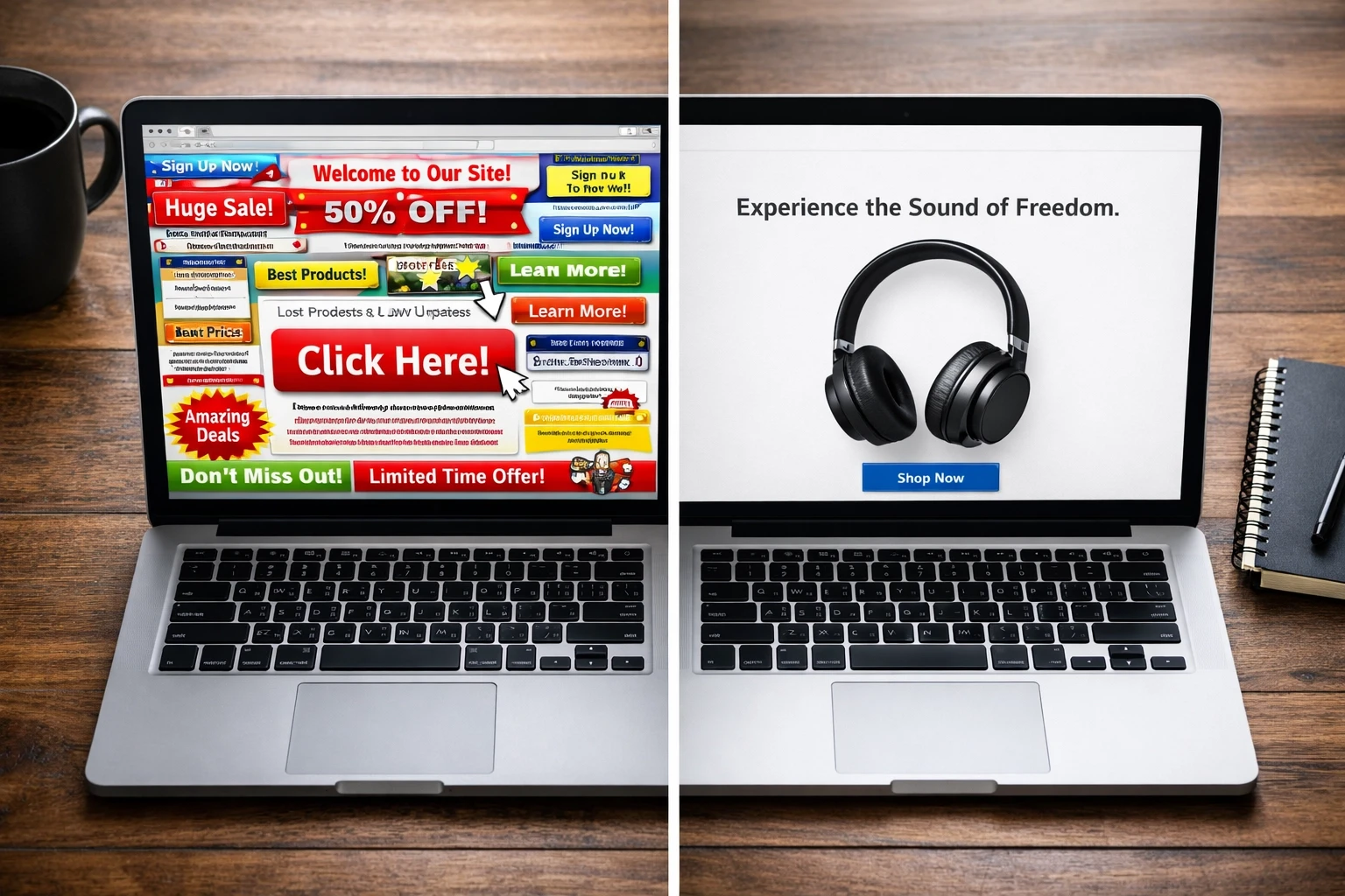
Vague value propositions: "Empowering innovation through synergistic solutions" tells me nothing. Are you selling software? Consulting? Enterprise blockchain yoga mats?
Buried headlines: If your actual offer is hidden three scroll-depths down, you've already lost the game.
Generic stock imagery: A diverse team high-fiving in a glass office doesn't explain whether you sell HR software or coworking memberships.
Missing calls-to-action: Visitors who want to buy, book, or download can't figure out how.
Feature dumping without context: Listing 47 features before explaining what your product does is like handing someone an IKEA manual before showing them the chair.
Example: A SaaS company selling project management software had the headline "Collaboration Reimagined" with a hero image of abstract geometric shapes. Three-second test result? "Uh... graphic design tool?" After changing the headline to "Project Management Software for Remote Teams" and showing an actual screenshot of the dashboard, their trial sign-ups increased 43%.
The micro-moment is everything. Visitors aren't reading your homepage like a novel, they're scanning for immediate proof that you solve their specific problem.
How to Perform a 3-Second Audit on Your Homepage
Running this audit takes less time than brewing coffee. Here's the exact process:
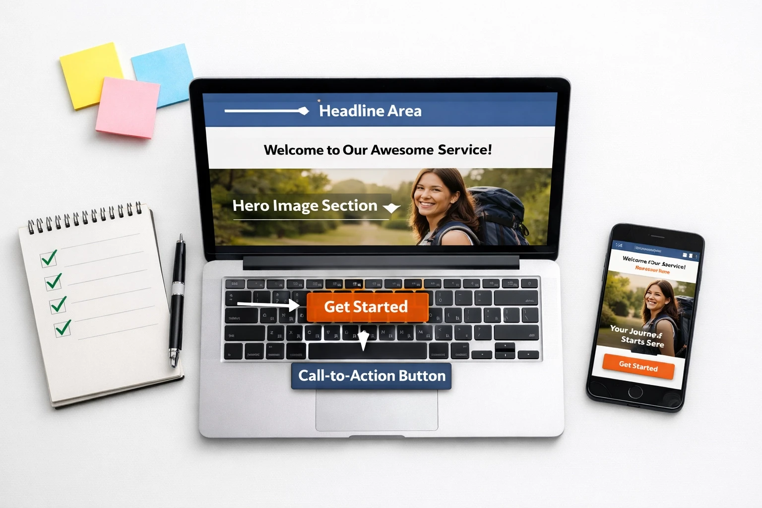
Step 1: Capture your above-the-fold screenshot
Take a screenshot of your homepage as it appears before any scrolling. This is the only real estate that matters for the 3-second test.
Step 2: Find a stranger
Grab someone who has zero context about your business. Coworker from a different department? Friend who isn't in your industry? Perfect.
Step 3: Show and tell
Display the screenshot for exactly 3 seconds, then hide it. Ask: "What does this company sell?" or "What would you do on this site?"
Step 4: Listen to the painful truth
If they answer correctly and confidently, you pass. If they pause, squint, or say something wildly off-base, you've identified a leak in your conversion funnel.
Step 5: Repeat with 3-5 people
One confused person might be an outlier. Three confused people is a pattern.

Pro tip: Record their reactions. The hesitation, the "um," the wrong guesses: that's exactly what your real visitors are experiencing before they bounce.
What Are the 3 Things a Visitor Needs to Know Immediately?
Every homepage: whether you're selling sneakers, SaaS subscriptions, or consulting services: must answer three questions instantly:
1. Identity: Who are you and what do you sell?
This is your headline and primary visual. Be explicit. Not "Transform Your Workflow" but "Time Tracking Software for Agencies." Not "Luxury Redefined" but "Handcrafted Leather Bags."
E-commerce example: "Sustainable Running Shoes for Trail Runners" + product image
SaaS example: "CRM Software Built for Real Estate Teams" + dashboard screenshot
Lead Gen example: "Immigration Lawyers Serving Toronto Since 2010" + professional photo
2. Value: Why should I care?
Your subheadline or support copy should immediately communicate the benefit. What problem do you solve? What outcome do you deliver?
E-commerce: "Zero-waste materials. Maximum performance."
SaaS: "Close 30% more deals with automated follow-ups."
Lead Gen: "We've helped 500+ families navigate complex visa applications."
3. Action: What do I do next?
Your call-to-action should be blindingly obvious. Whether it's "Shop Now," "Start Free Trial," or "Book Your Consultation," make it impossible to miss.
Avoid CTA confusion. Don't offer seven equal buttons ("Learn More," "Watch Demo," "Read Case Studies," "Download White Paper," "Schedule Call"). Pick the one action that matters most and make it the hero.
Clarity Checklists: Does Your Site Pass?
Different business models need slightly different clarity elements. Here's how to audit yours:
E-Commerce Clarity Checklist:
Product is visible above the fold (actual product photo, not lifestyle imagery alone)
Category or product type is explicit ("Organic Baby Clothing" not just "Shop Now")
Price range or "Starting at" indicator (manages expectations immediately)
Trust signals visible (free shipping, returns, secure checkout badges)
Primary CTA is action-oriented ("Shop Women's Jackets" beats "Explore")
SaaS/B2B Clarity Checklist:
Software category is stated in headline ("Email Marketing Platform" not "Marketing Automation")
Target customer is identified ("for E-commerce Brands" or "for Startups")
Dashboard or product UI is shown (screenshots build instant credibility)
Outcome or metric is quantified ("Save 10 hours/week" or "2x your email revenue")
Trial CTA is friction-free ("Start Free Trial" with no credit card requirement mentioned)
Lead Gen/Service Business Clarity Checklist:
Service type is explicit ("Personal Injury Lawyers" not "Legal Experts")
Geographic area is stated (if location matters: "Serving Austin, TX")
Social proof is immediate ("500+ 5-star reviews" or client logos)
Qualification criteria is clear ("Free consultation for cases over $50K")
Contact method is obvious (phone number in header, "Schedule Call" button prominent)
Getting Started: Fix Your Clarity Today
You don't need a full redesign to pass the 3-second test. Start with these high-impact changes:
Rewrite your headline to include your category. "Project Management Tool" beats "Work Smarter, Not Harder."
Replace abstract hero images with product visuals. Show your software dashboard, your product, or your team actually working.
Add a one-sentence subheadline that states your primary benefit or target customer.
Reduce CTA choices to one primary action. Everything else is secondary navigation.
Test with real strangers before you publish. Their confusion is your data.
The websites that convert aren't the cleverest: they're the clearest. Start your 3-second audit today and watch your bounce rate drop.
More Insights
Explore ideas, tips, and trends to elevate your brand.


