(
)
The Anatomy of a High-Converting Checkout: Why Your Cart is a Psychology Problem, Not a Tech One
Most DTC and SaaS leaders treat their checkout like a technical gateway: a necessary set of pipes that moves data from a user’s credit card to their bank account. If the "Place Order" button works and the API doesn’t throw a 500 error, they assume the job is done. But the truth is that by the time a user reaches your checkout, the technical battle is mostly won, and the psychological war has just begun.
Your checkout isn't just a form; it is the final, most critical "Revenue Surface" of your entire business. It is the exact point where a user’s desire to solve a problem meets their innate fear of loss and uncertainty. If you aren't optimizing for how the human brain processes risk and effort, you’re leaving significant revenue on the table.
Why do we call the checkout the ultimate "Revenue Surface"?
In a high-growth environment, we often focus on the top of the funnel: more ads, more content, more traffic. However, the checkout represents the highest-leverage area for growth because it is where your traffic has the most intent. A 1% improvement here is worth exponentially more than a 1% improvement at the top of the funnel because these users are already "at the door."
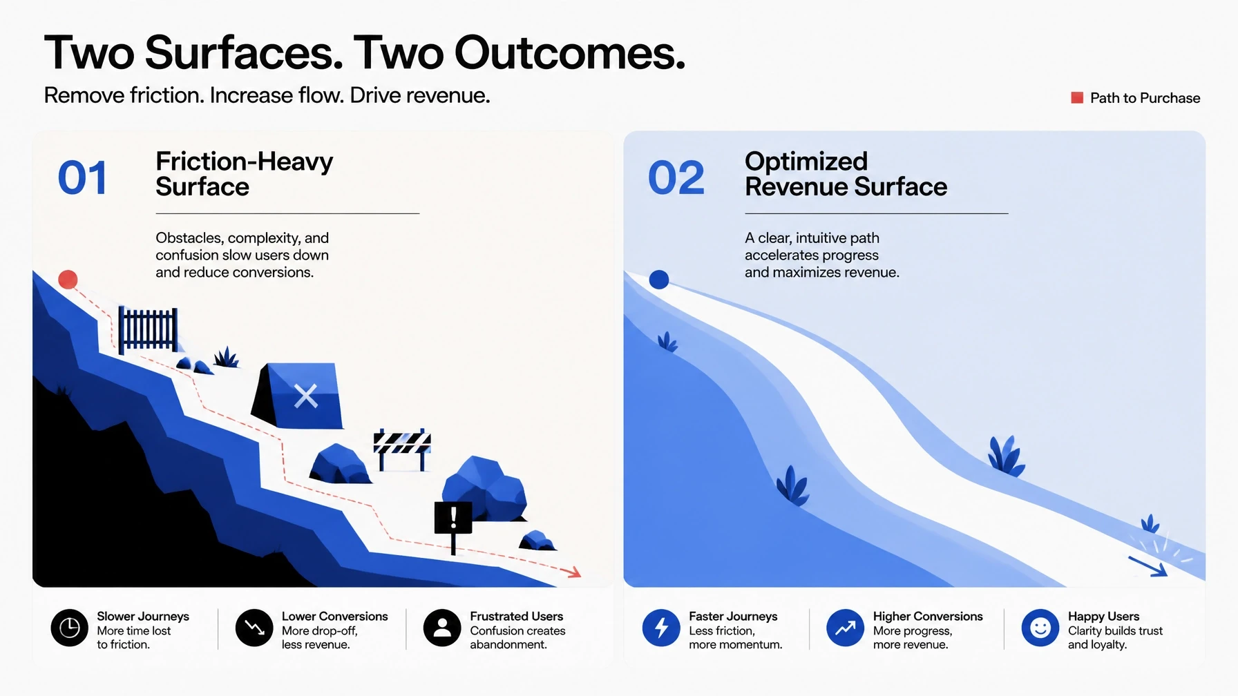
Think of your checkout as a physical surface that users must navigate. If that surface is slick, intuitive, and frictionless, they slide right through to a purchase. If it’s rough, confusing, or feels "thin," they’ll get stuck and eventually walk away. Every field you add and every second of delay acts as a physical barrier on this surface.
When you optimize this revenue surface, you aren't just changing button colors. You are tightening the connection between a customer's intent and your company’s bank account. This is the third installment in our Anatomy series, moving beyond the audit and into the strategic heart of the conversion.
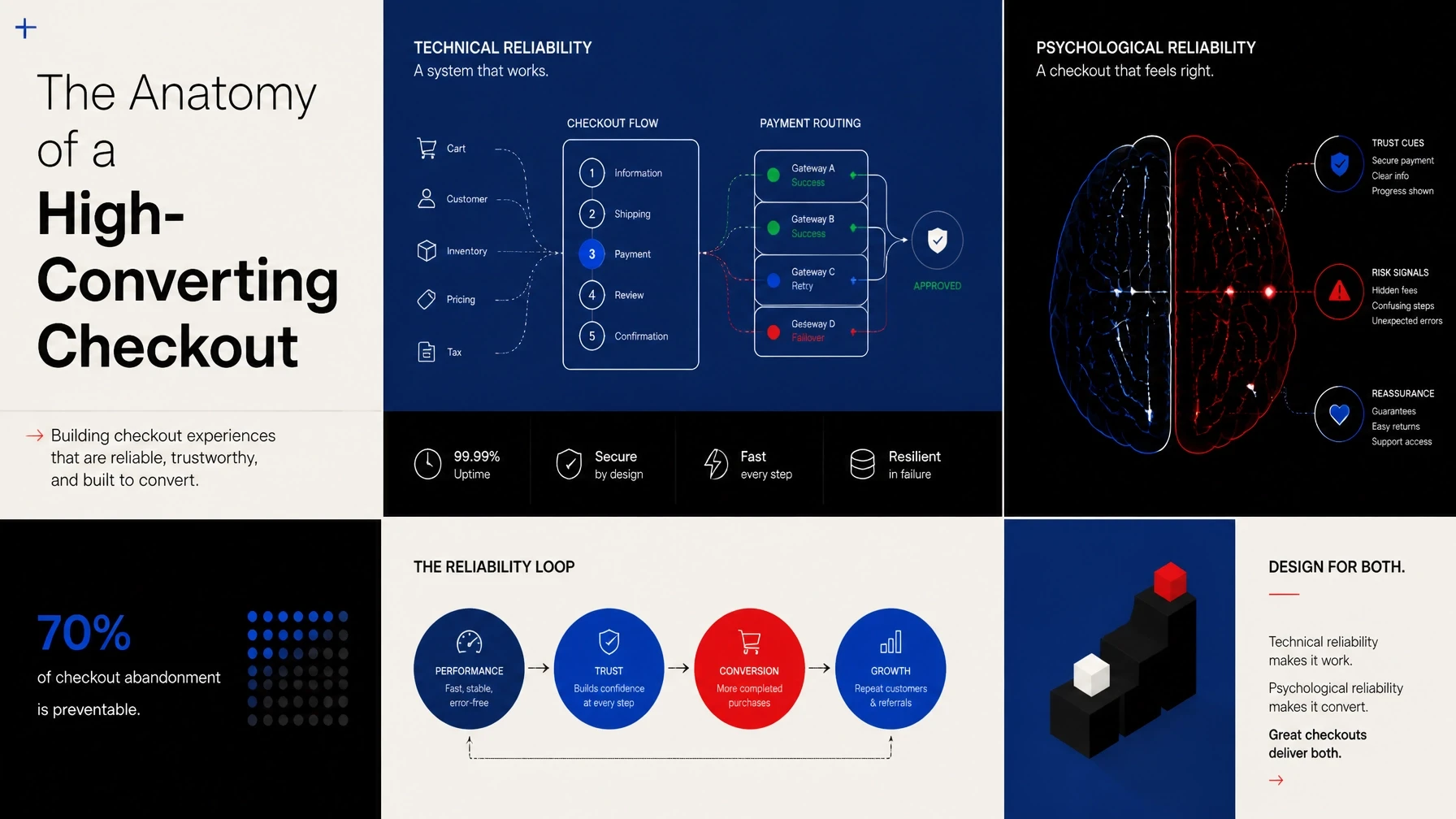
What is the difference between Technical and Psychological Reliability?
Technical reliability is binary: either the page loads, or it doesn't. It’s the baseline requirement for doing business online: speed, stability, and payment gateway success. According to research by Stripe, even a tiny technical hitch during payment can cause a permanent loss of trust.
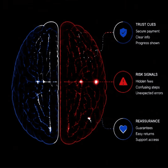
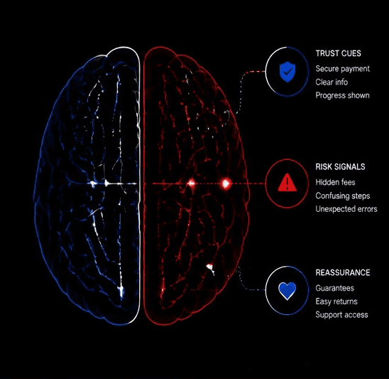
Psychological reliability, however, is about the perception of safety and ease. A checkout can be technically flawless: lightning fast and secure: but still feel "unreliable" to a user. If the branding is inconsistent, the pricing is opaque, or the mobile experience is clunky, the user's brain registers a "threat" signal.
To win at checkout, you must solve for both. Technical reliability keeps the lights on, but psychological reliability is what actually closes the deal. You need to ensure the system is not only robust but feels robust to a human who is naturally skeptical about parting with their money.
Why does cognitive load kill your conversion rate?
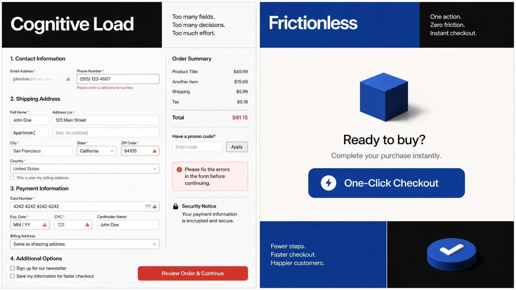
The human brain is remarkably efficient at conserving energy, which means it hates doing extra work. Every time you ask a user to think: to choose between shipping methods they don't understand or to find their zip code manually: you increase their cognitive load. Baymard Institute consistently finds that "too long or complicated checkout process" is one of the top reasons for cart abandonment.
When cognitive load becomes too high, users don't just get annoyed; they stop. They experience decision fatigue, especially if they’ve already spent time browsing and comparing products. By the time they hit the checkout, their mental "battery" is low, and they are looking for reasons to quit.
Your goal is to make the checkout feel like a "downhill" experience. This means using smart defaults, collapsing unnecessary fields, and providing clear, inline validation. If you can reduce the number of micro-decisions a user has to make, you’ll see an immediate lift in your conversion metrics.
How do you build trust without cluttering the UI?
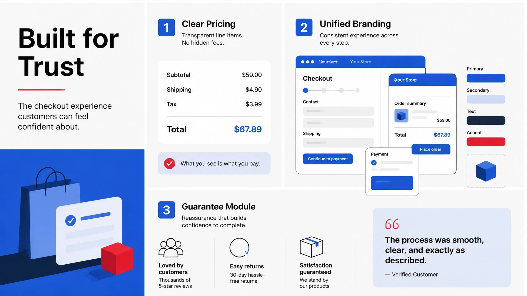
Many brands make the mistake of thinking trust is built by plastering "security badges" and "as seen on" logos everywhere. In reality, trust is built through clarity, consistency, and transparency. A clean, high-quality UI/UX design communicates more trust than a dozen generic security shields ever could.
Transparency is particularly vital when it comes to pricing. Hidden fees: taxes, shipping costs, or service charges: that only appear at the final step are the single biggest trust killers in ecommerce. The brain perceives these as a "trick," triggering an immediate defensive response that often leads to a closed tab.
Implicit trust is also built through familiar payment patterns. Offering "one-click" options like Apple Pay or Shop Pay doesn't just save time; it transfers the trust the user already has in those platforms to your brand. When the checkout feels familiar, the perceived risk drops significantly.
What happens when logic meets loss aversion in SaaS and DTC?
Loss aversion is the psychological principle that the pain of losing is twice as powerful as the joy of gaining. At the checkout, users are focused on what they are losing: their hard-earned money. To counter this, your checkout must pivot the conversation back to what they are gaining.
In SaaS, this means reinforcing the value proposition right at the moment of payment. Remind the user of the time they’ll save or the ROI they’ll achieve once they click "Subscribe." Use a simple summary of benefits near the final call-to-action to keep their eyes on the prize.
For DTC, reducing the fear of loss often comes down to your return policy and shipping guarantees. "Free returns" or "30-day money-back guarantee" are powerful psychological tools because they lower the perceived risk of the transaction. You are essentially telling the customer, "You aren't losing anything if this doesn't work out."
How can you start optimizing for the human brain today?
You don't need a total site redesign to start seeing results. You can begin by auditing your current checkout flow through the lens of psychology rather than just tech. Look for areas where the user might feel uncertain, overwhelmed, or "tricked" by the interface.
Here are a few immediate steps you can take to tighten your revenue surface:
Audit your mobile friction: Try completing your own checkout using only one hand on a mobile device; if it’s hard, your customers are struggling too.
Remove "Guest Checkout" as a choice: Instead of asking "Checkout as guest or create account?", just start the guest checkout process and offer account creation after the purchase.
Expose costs early: If you can’t calculate exact shipping, give a clear estimate on the product or cart page to avoid "sticker shock" at the final step.
Consolidate fields: Do you really need the "Phone Number" or "Company Name" for every single order? If not, kill those fields and watch your completion rates rise.
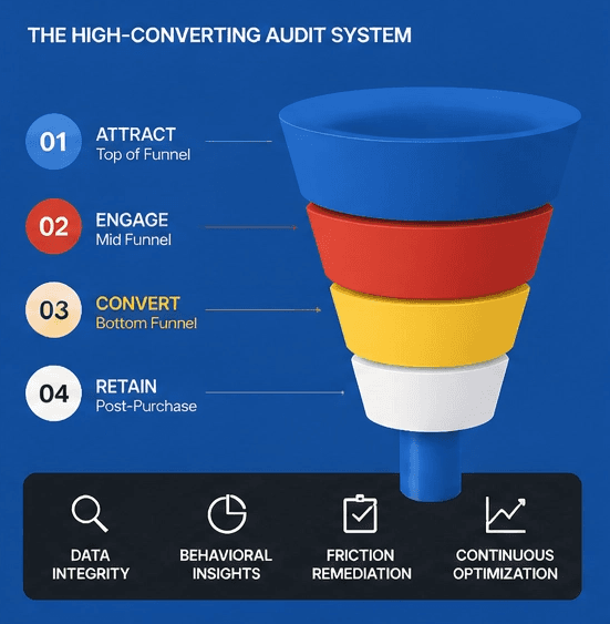
Optimizing your checkout is a continuous process of removing friction and building trust. If you're ready to dive deeper into how data-driven changes can impact your bottom line, take a look at our comprehensive guide to CRO or check out our 4-step process for turning more visitors into customers.
More Insights
Explore ideas, tips, and trends to elevate your brand.