
(
)
Mind Reading 101: Using Behavioral Analytics to Decode User Intent
Behavioral analytics helps you understand user intent by observing what people actually do on your site—where they pause, what they click, how far they scroll, and where they give up.
How to Use Behavioral Analytics to Understand User Intent on Your Website?
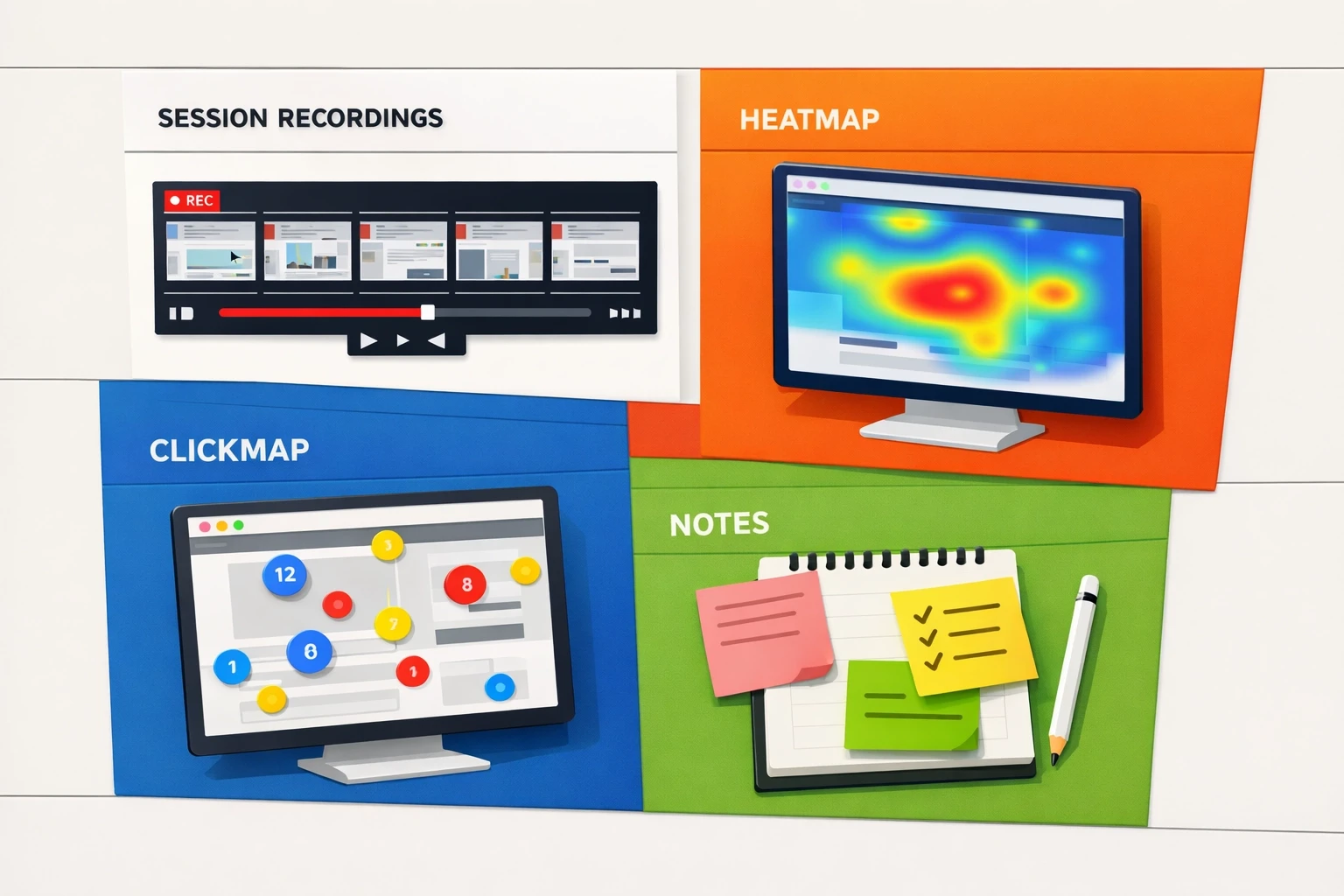
Heatmaps show attention and scroll behavior, click maps show interaction (including frustration clicks), and session recordings show full journeys. When you combine the three, you can move from “the numbers look off” to a clear list of specific, fixable issues.
Direct Answer
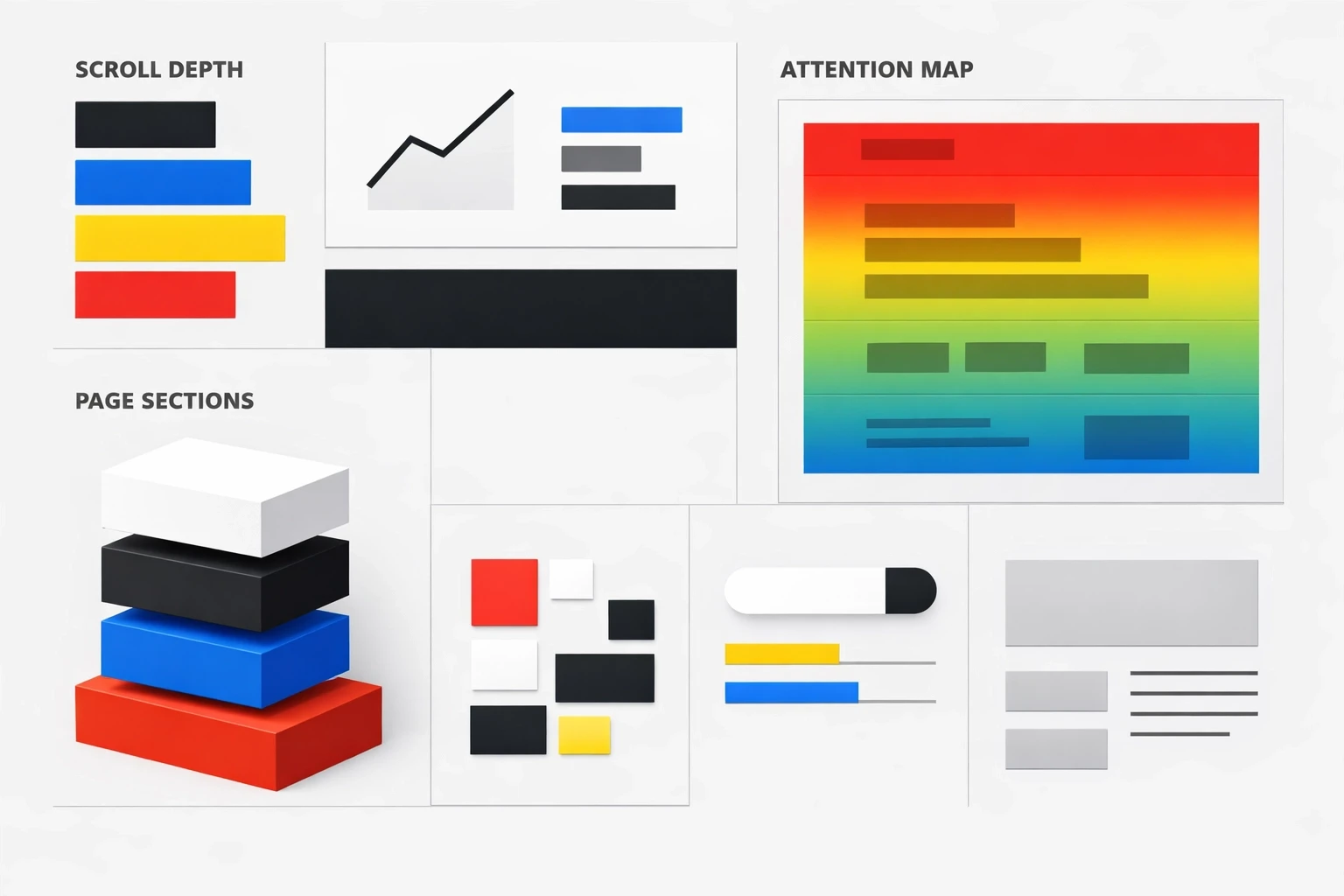
Heatmaps show what gets seen (attention + scroll depth), so you can place key information where people will actually encounter it.
Click maps show what gets clicked/tapped, including dead clicks (people clicking things that aren’t clickable).
Session recordings show how a visit unfolds, so you can see confusion, backtracking, form errors, and drop-off moments in context.
Simple workflow: Choose one important page → review ~20 recordings → tag repeated friction → verify with heatmaps/click maps → make 1–3 changes → review another batch to confirm the experience improved.
What is behavioral analytics and why does it matter?
Direct Answer: Behavioral analytics captures on-page actions (clicks, scrolls, hesitations, navigation loops) so you can infer intent (what someone is trying to do) and friction (what’s getting in their way). It complements traditional analytics by adding context to the “why.”
Behavioral analytics focuses on observable behaviors: where attention clusters, what elements attract clicks, where people stop scrolling, and where they repeatedly hesitate or backtrack.
Traditional analytics is strong at totals and trends (sessions, bounce rate, conversion rate). What it usually can’t tell you is what the experience felt like for someone who:
Can’t find an answer to a basic question (like pricing, compatibility, or timing)
Treats a visual element as a button and clicks it repeatedly
Hits a form error and exits
Scrolls rapidly because the page isn’t matching the promise of the ad or search result
Behavioral data helps you connect the metric (“drop-off increased”) to a concrete cause (“people are getting stuck at this section”).
What kinds of user intent should you look for?
Direct Answer: Most website intent fits into four categories—informational, navigational, commercial investigation, and transactional. Knowing which intent is dominant on a page helps you interpret behavior correctly (and avoid “fixing” the wrong thing).
Intent is the job a visitor is trying to get done on a specific page.
Most on-site intent falls into four buckets:
Informational intent: They want understanding (definitions, steps, proof, context).
Navigational intent: They want to reach a specific destination (login, support, contact, a particular page).
Commercial investigation: They want to evaluate options (details, pricing context, comparisons, reviews, FAQs).
Transactional intent: They want to complete an action (checkout, trial, demo, booking).
This matters because friction is intent-dependent. For example, informational visitors often leave when the page feels vague or doesn’t answer the question quickly. Transactional visitors often leave when the path feels slow, risky, or unclear.
How can I see what visitors are doing on my site?
Direct Answer: Use heatmaps, click maps, and session recordings together. Heatmaps show attention and scroll behavior, click maps show interaction, and recordings show the full path—what people tried to do and what happened next.
Use three tools together because each one is partial:
1) Heatmaps (attention + scroll)
Heatmaps show what gets seen and how far visitors scroll.
If most visitors don’t reach an important section, that content may as well not exist.
If scroll depth drops sharply after the first screen, the page may be unclear, overwhelming, or mismatched to the visitor’s expectation.
If attention clusters on a single line or element, it may be the clearest explanation—or the most confusing part.
2) Click maps (interaction maps)
Click maps show what people click/tap (and what they try to click).
Dead clicks often signal misleading affordances (something looks interactive but isn’t).
Heavy clicking on secondary links can indicate information gaps or risk concerns that aren’t addressed in the main content.
Low clicks on a primary CTA can indicate weak visibility, poor placement, competing distractions, or low confidence in the offer.
3) Session recordings (real journeys)
Recordings let you see behavior in sequence—what happens before the drop-off and what the visitor tried right before leaving.
Common patterns include:
Hesitation (slow scroll, hovering, rereading)
Backtracking (repeated up/down scrolling or returning to earlier sections)
Rage clicks (rapid clicks on an element that isn’t responding as expected)
Form friction (errors, confusion, abandonment at the same field)
How do I use heatmaps, session recordings, and click maps to understand why people leave or stay?
Direct Answer: Look for behaviors that repeat across multiple sessions, then triangulate: use recordings to see the sequence, heatmaps to confirm visibility/attention, and click maps to confirm interaction. You’re trying to answer one question: what prevented the visitor from completing their job?
The goal isn’t to collect interesting screenshots. It’s to identify repeatable patterns that explain outcomes you see in standard analytics.
Common “leave” patterns (and what they usually mean):
Scroll stops early → the page doesn’t deliver the expected answer quickly, or the first screen is overloaded.
Many clicks on FAQs → visitors are looking for details or reassurance that isn’t prominent in the main content.
Dead clicks on images/headlines → the design suggests interactivity where there isn’t any.
Repeated scroll up/down → visitors are searching for a missing answer (pricing, compatibility, shipping, timeline).
Form starts but no submits → unclear requirements, field errors, privacy concerns, or the form feels too long.
Common “stay” patterns (and what they usually mean):
Steady scroll depth → the page structure and sequencing make sense.
Clicks cluster on one path → the next step is easy to find and feels safe to take.
Recordings show smooth completion → fewer surprises, fewer errors, and fewer “where do I go next?” moments.
How do I turn session recordings into website improvements?
Direct Answer: Use recordings to find repeated friction, label it consistently, prioritize it by frequency/impact/effort, then translate it into 1–3 concrete page changes. Re-review recordings afterward to confirm the friction actually decreased.
Session recordings can become a time sink if you watch them without a system. A lightweight process keeps them useful.
Step 1: Watch with a simple checklist
As you review, tag moments like:
Confusion (pauses, hovering, rereading)
Navigation loops (back button, menu bouncing)
Misclicks / dead clicks
Form errors or abandonment
Device-specific pain (mobile zooming, tiny tap targets)
Step 2: Group repeats, then prioritize
After ~20 recordings on one page, patterns usually show up.
Prioritize by:
Frequency: how often it occurs (e.g., 8/20 sessions)
Impact: how directly it blocks the primary action
Effort: how quickly you can address it without redesigning everything
Step 3: Convert patterns into shippable changes
Common high-leverage changes include:
Move the core answer above the fold (pricing range, key constraints, what’s included, who it’s for)
Add 3–5 bullets that remove uncertainty (timeline, cancellation, returns, compatibility)
Make the primary CTA easy to spot and place it near moments of highest confidence (often after key proof/reassurance)
Reduce competing links near the primary action
Simplify forms (fewer fields, clearer labels, inline validation)
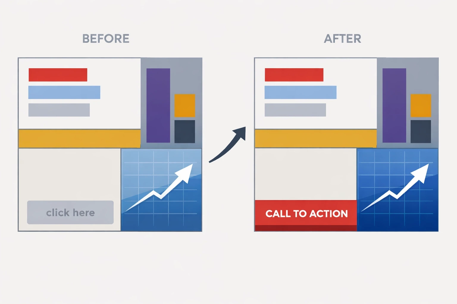
Example: Turning behavior into a measurable lift
Direct Answer: Use recordings to identify the “missing answer,” use click maps to confirm what people are trying to learn, then restructure the page so key answers appear earlier—before asking for commitment.
Scenario: A SaaS pricing page gets solid traffic, but sign-ups are low. In recordings, visitors frequently bounce between the headline and the FAQ. Click maps show repeated interaction with “What’s included?” and “Can I cancel anytime?”
Interpretation: Visitors are trying to reduce risk before taking action, and the page is making them work to find reassurance.
Change: Move the top reassurance items above the fold (what’s included, cancellation terms, setup time). Add a short, scannable summary that answers those questions without requiring scrolling. Place a CTA immediately after that reassurance section so the next step is available when confidence is highest.
How do I get started with behavioral analytics (without overcomplicating it)?
Direct Answer: Start with one high-impact page, define the visitor’s job, review ~20 recordings, validate patterns with heatmaps/click maps, then make 1–3 changes and review again.
Keep it simple. The goal is decisions, not dashboards.
Pick one high-impact page (pricing, product, checkout, lead form).
Write the “job to be done” in one sentence (what they came to decide/do).
Watch ~20 session recordings and tag the friction moments.
Check heatmaps + click maps to confirm it’s a pattern, not a one-off.
Make 1–3 changes, then review a fresh batch to see whether hesitation, loops, and drop-offs decreased.
Frequently Asked Questions
What’s the difference between heatmaps and click maps?
Heatmaps typically show attention/scroll patterns (what gets seen). Click maps show interaction (what gets clicked/tapped). You want both because “seen” and “used” are different.
How many session recordings do I need to watch?
Start with 20 on a single page. Patterns show up fast. If the traffic is diverse (multiple sources/devices), watch 10 mobile + 10 desktop.
What should I look for first in recordings?
Start with the first 10 seconds and the last 10 seconds. The beginning reveals intent match; the end reveals the specific breaking point.
Are rage clicks always bad?
Yes. Rage clicks usually signal broken UI, misleading affordances (looks clickable but isn’t), slow loading, or a blocked path.
Can behavioral analytics replace A/B testing?
No—behavioral analytics tells you what to fix and why. Testing confirms which fix performs best and by how much.
More Insights
More Insights
Explore ideas, tips, and trends to elevate your brand.


