
(
)
The Anatomy of a High-Converting Audit: How to Actually Fix Your Website
Most websites don’t struggle because of one bad design choice. They struggle because decisions get made without enough evidence.
![[HERO] The Anatomy of a High-Converting Audit: How to Actually Fix Your Website (Without the Guesswork)](https://framerusercontent.com/images/gsYje1TKNKHLjLfhohVghyBwFPE.webp)
Teams often jump to tactics like changing button colors or adding testimonials. Those changes can help, but without a structured way to identify what is actually blocking customers (and where), you end up running in circles.
For context on how big the stakes can be: the Baymard Institute reports an average 70.2% cart/checkout abandonment rate in e-commerce. Source: https://baymard.com/lists/cart-abandonment-rate
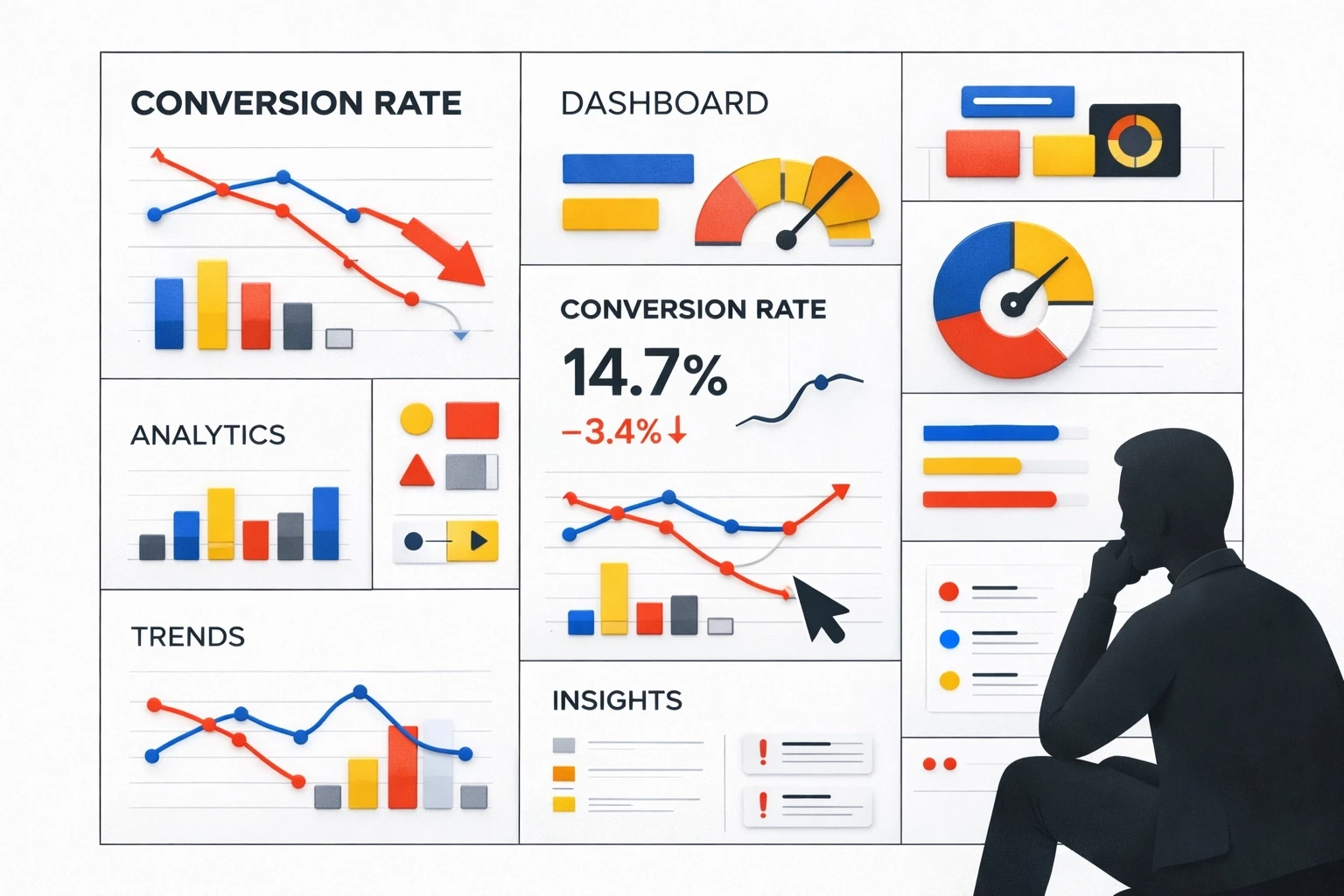
A high-quality website audit replaces guesswork with a repeatable method: evaluate usability, validate with behavioral data, prioritize by impact, then iterate.
Why do “gut-feel” fixes usually waste time?
Your instincts are biased by familiarity, so you need an objective checklist and real user behavior to find what’s actually broken.
If you’ve lived with your site for months, you stop noticing friction. You already know what you sell, where the pricing is, what the jargon means, and which buttons matter. New visitors don’t have that context, so they get lost faster than you expect.
A practical way to reduce bias is to use established usability principles as a checklist. Jakob Nielsen’s usability heuristics are widely referenced because they’re simple and behavior-focused (system feedback, clear labels, error prevention, consistency, and so on). Source: https://www.nngroup.com/articles/ten-usability-heuristics/
Used well, heuristics don’t “grade design.” They flag predictable points where people hesitate, misinterpret, or give up.
A useful audit is deliberately systematic. It documents what you observe, ties it to evidence, and produces a prioritized list of fixes you can actually ship.
What should you look for in a heuristic walkthrough?
Walk your site like a first-time customer and score it against known usability principles, focusing on clarity, navigation, and friction on key paths.
Before you touch analytics dashboards, define the “happy path” for a visitor (what they should do) and then inspect the pages that support it (what the page actually communicates and enables).
A heuristic walkthrough usually answers questions like:
Can a first-time visitor understand what you sell within a few seconds?
Is the primary action obvious on each key page?
Does navigation match how people think, not how your org chart is structured?
Are forms and checkouts asking for more effort than the value you’ve earned so far?
Use scanning behavior as a reality check. Many people scan rather than read, so critical information needs to show up early and clearly. Nielsen Norman Group summarizes common scanning patterns (including the F-pattern) and how to design for them. Source: https://www.nngroup.com/articles/f-shaped-pattern-reading-web-content/
The goal isn’t to make pages “busier.” It’s to make the next step unmissable and low-friction.
What data tells you where people are getting stuck?
Use analytics to find where drop-offs happen, and behavior tools (heatmaps/recordings) to understand why they happen.
Once the heuristic pass highlights likely friction points, validate them with behavioral evidence:
Google Analytics 4 (or equivalent):
Identify top landing pages and highest-exit pages
Find funnel drop-off steps (product → cart → checkout, pricing → signup, etc.)
Segment by device (mobile vs desktop) because “fine on my laptop” is a common trap
Heatmaps + session recordings (e.g., Hotjar, Microsoft Clarity):
Look for dead clicks (clicks on non-clickable elements)
Look for rage clicks (rapid repeated clicks that signal frustration)
Watch where attention clusters versus where you want attention to go
Form and checkout analysis:
Track field-level drop-off and error rates
Note which steps cause the biggest abandonments (shipping, account creation, payment, etc.)
Use Baymard’s checkout research as a benchmark and idea source for common issues. Source: https://baymard.com/lists/cart-abandonment-rate

A simple habit: watch 5–10 session recordings focused on a single goal (checkout, lead form, trial signup). Patterns show up quickly—misclicks, hesitation, back-and-forth navigation, or repeated errors. It’s one of the fastest ways to spot friction that doesn’t show up in a spreadsheet.
How do you prioritize fixes without boiling the ocean?
Rank issues by expected impact and effort so you ship the highest-leverage fixes first.
After an audit you’ll usually have dozens of “valid” problems. The mistake is treating them as equal.
A simple method is the PIE framework:
Potential: If you fix it, how much could it move the needle?
Importance: How many customers hit this step (and how close is it to revenue)?
Ease: How quickly can you ship a fix (and validate it)?
Score each 1–10, then multiply (or just sort by a weighted total). The exact math matters less than consistency. What you’re doing is forcing trade-offs so the team doesn’t drift into random improvements.
In practice, high-priority items tend to be:
Broken or confusing checkout steps
Mobile-specific issues on high-traffic pages
Unclear “what is this?” messaging above the fold on key landing pages
Lower-priority items tend to be:
Cosmetic inconsistencies on low-traffic pages
Nice-to-have layout tweaks that don’t change comprehension or task completion

How do you turn an audit into an ongoing improvement loop?
Audits work best as a cadence: monitor, diagnose, ship fixes, measure, repeat.
A one-time audit can still help, but websites change constantly: product updates, new campaigns, new devices, shifting customer expectations. If you don’t revisit assumptions, performance drifts.
A practical cadence looks like:
Monthly: Review key funnel metrics and watch a small batch of recordings (goal-focused).
Quarterly: Re-audit the highest-traffic and highest-revenue paths (landing → signup, product → checkout).
Annually: Do a full journey review end-to-end, including mobile and cross-browser checks.
The point isn’t “always be changing the site.” It’s to keep a lightweight feedback loop so you catch friction early and prioritize rationally.
How do you run a useful audit this week (without overcomplicating it)?
Pick one key customer path, audit it with heuristics + data, log issues, prioritize, ship one fix, and measure.
You don’t need a massive project plan to get value quickly. You need a focused scope and a way to record what you’re finding.
1) Choose a single “money path”
Examples:
E-commerce: product page → cart → checkout
SaaS: pricing page → signup → activation step
Lead gen: landing page → form → thank-you page
2) Do a heuristic walkthrough (30–60 minutes)
Start on mobile and desktop
Note unclear language, missing feedback, confusing navigation, and unnecessary steps
If possible, ask one person who hasn’t seen the site to narrate what they think each page is saying
3) Pull supporting data (30 minutes)
Identify the biggest drop-off step in your funnel
Segment by device and traffic source
Use a few recordings/heatmaps to confirm what people are struggling with
4) Document issues in one place
A simple spreadsheet works:
Issue
Page/step
Evidence (metric, recording timestamp, screenshot)
PIE score
Proposed fix
5) Fix one high-priority item and measure
Ship a single change that reduces friction or increases clarity (not a bundle of changes). Track the before/after metrics for that step.
6) Repeat on a schedule
Keep it lightweight, but consistent. The compounding effect usually comes from fixing the obvious blockers you can’t see until you watch real behavior.
More Insights
Explore ideas, tips, and trends to elevate your brand.


